Client:

Boultbee Brooks & Infraland


Project:

Infrabee ID
Back
What we did
The project
Our approach
What we did
The project
Our approach

{↑} Infrabee logo animation.

{↓} Logomark inspiration.

{→}{↓} Colour palette inspired by nature.

{↑} Custom typography 'Infrabee Sans'.
The stroke of the N and the bar in the A mirror the angles in the logo mark.

{←} Full character set of Infrabee Sans.

{↓} Infrabee tagline.

{↑} Supporting typeface Plus Jakarta Sans.

{→} Infrabee Sans numeral set.

{↓} Icons use the core DNA of the Infrabee logomark.

{←}{↓} Fully responsive website, designed and built by Studio.Build to work seamlessly across all browser sizes and types.

{↓} Custom map to show the Infrabee project locations.

{↑}{↓} Social media icons and assets.

{↑} Social media posts.
{←}{↓} Infrabee taglines.

{↑} Business cards.
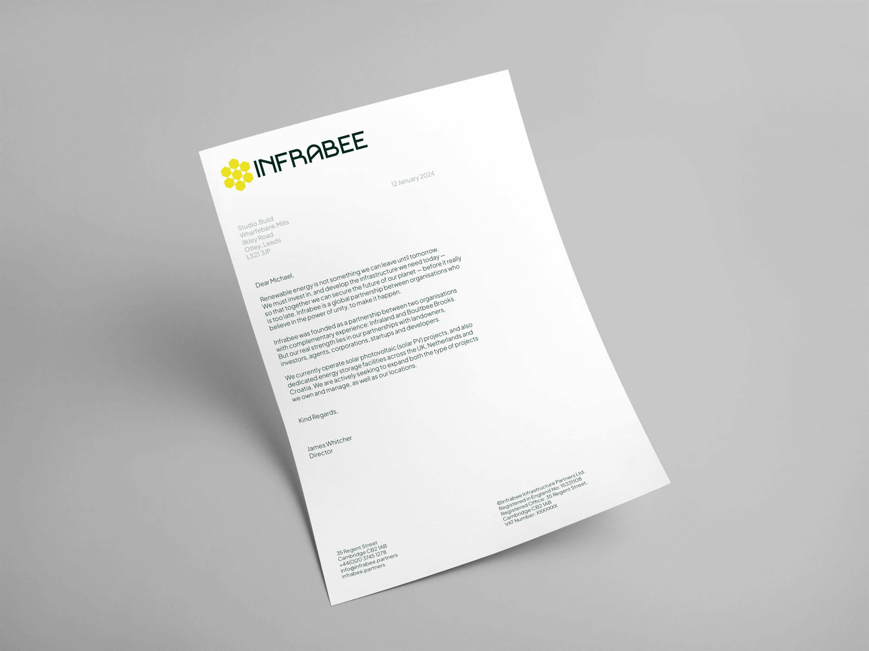
{→} Printed letterhead.

“Infraland and Boultbee Brooks engaged with Studio.Build to create a new website and brand identity for our latest venture INFRABEE. Right from the off, they seemed to grasp our thoughts and distil them into a cohesive and presentable message through the text, structure, graphics and images on the new website.
        The design team has a fantastic design eye and a skilful ability to create a consistent tone of voice throughout the website. They were patient in the early stages as we formed our ideas and once the ideas took shape they drove the project forward with a reassuring confidence.
        We set an ambitious target of completing the new website and branding over an 8-week period and the team managed to complete the project within the timeframe. They proactively and sympathetically chased for data and various inputs to keep the project on track.
        Thank you. I look forward to working with Studio.Build again when the next project presents itself.”
— Henry Brown, Director (Infrabee)

Client:

Boultbee Brooks & Infraland

Project:

Infrabee ID
What we did
The project
Our approach
What we did
The project
Our approach

{↑} Infrabee logo animation.

{↑} Logomark inspiration.

{↑}{↓} Colour palette inspired by nature.

{↑} Custom typography 'Infrabee Sans'. The stroke of the N and the bar in the A mirror the angles in the logo mark.

{↑} Full character set of Infrabee Sans.

{↑} Infrabee tagline.

{↑} Supporting typeface Plus Jakarta Sans.

{↑} Infrabee Sans numeral set.

{↑} Icons use the core DNA of the Infrabee logomark.

{↑}{↓} Fully responsive Infrabee website, designed and built by Studio.Build to work seamlessly across all browser sizes and types.

{↑} Custom map to show the Infrabee project locations.

{↑}{↓} Social media icons and assets.

{↑} Social media posts.

{↑} Infrabee taglines.

{↑} Business cards.

{↑} Printed letterhead.

“Infraland and Boultbee Brooks engaged with Studio.Build to create a new website and brand identity for our latest venture INFRABEE. Right from the off, they seemed to grasp our thoughts and distil them into a cohesive and presentable message through the text, structure, graphics and images on the new website.
        The design team has a fantastic design eye and a skilful ability to create a consistent tone of voice throughout the website. They were patient in the early stages as we formed our ideas and once the ideas took shape they drove the project forward with a reassuring confidence.
        We set an ambitious target of completing the new website and branding over an 8-week period and the team managed to complete the project within the timeframe. They proactively and sympathetically chased for data and various inputs to keep the project on track.
        Thank you. I look forward to working with Studio.Build again when the next project presents itself.”
— Henry Brown, Director (Infrabee)